Article overview
Design around the buying journeyGood ecommerce design helps a shopper understand the product, decide whether it fits their needs and complete an order confidently. An attractive homepage is only one part of that journey. The five priorities below cover mobile usability, accessibility, performance and reliable review practices.1. Establish a clear, consistent brandCreate a practical style guide covering logos, type, colours, photography and tone. Apply it to product pages, checkout-related content and customer emails as well as the homepage. Keep promotional banners legible and avoid placing essential details inside an image alone.2. Make navigation usable and accessibleOrganise collections around how customers look for products. Provide relevant filters and descriptive labels, and make the current choice easy to see and change. On product pages, show the price, options, availability and delivery information near the purchase action.Design around the buying journey
Good ecommerce design helps a shopper understand the product, decide whether it fits their needs and complete an order confidently. An attractive homepage is only one part of that journey. The five priorities below cover mobile usability, accessibility, performance and reliable review practices.
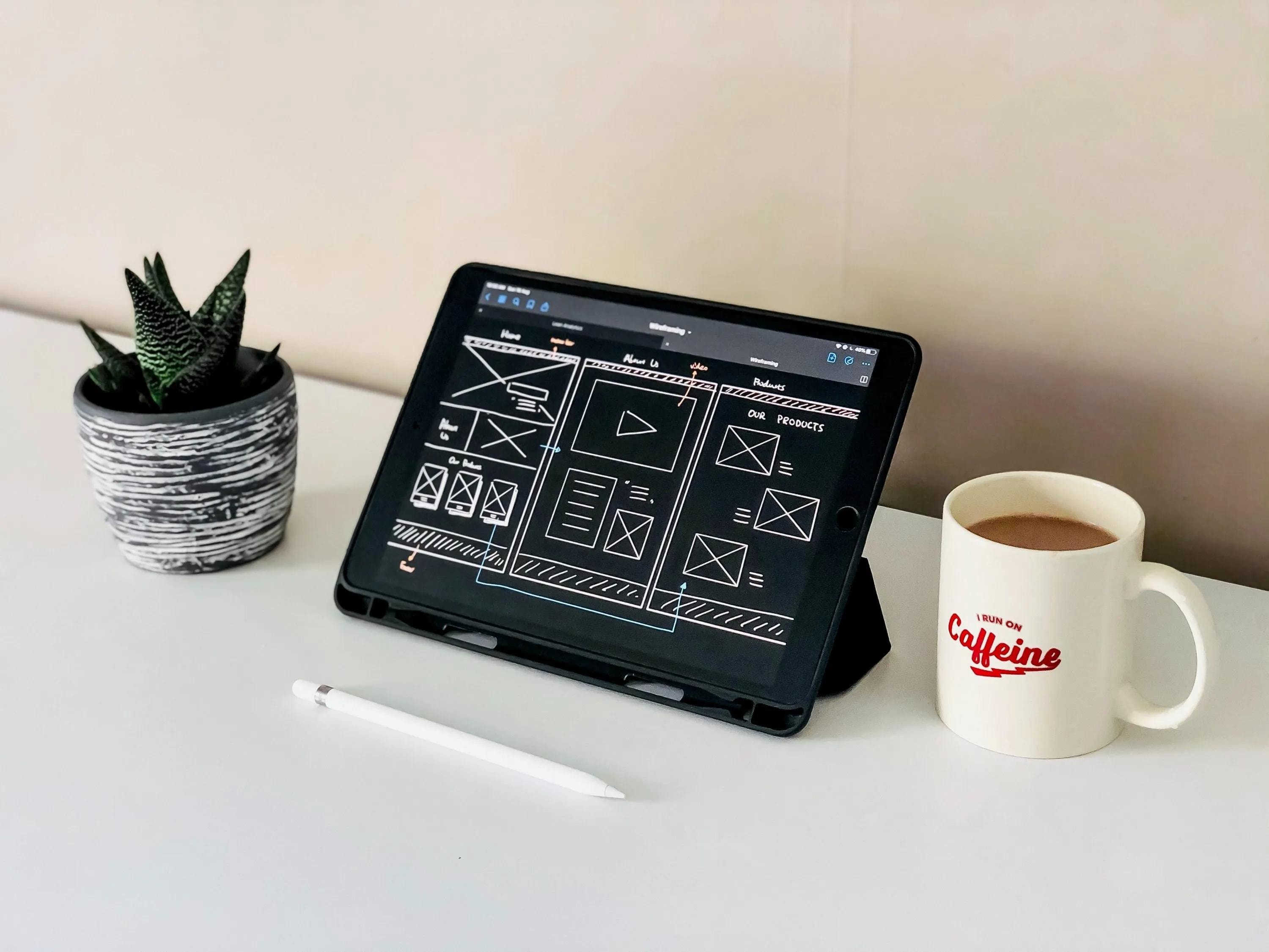
A tablet wireframe illustrates planning a store layout before building the pages. Image: Navy FAB Academy.
1. Establish a clear, consistent brand
Create a practical style guide covering logos, type, colours, photography and tone. Apply it to product pages, checkout-related content and customer emails as well as the homepage. Keep promotional banners legible and avoid placing essential details inside an image alone.
Storefront examples below show earlier designs; live interfaces may have changed.
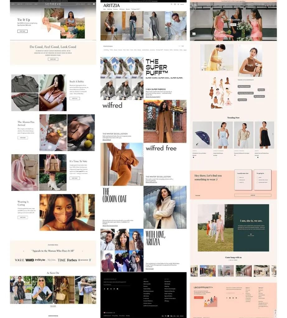
Storefront layouts from Senreve (left), Aritzia (centre) and Love Bonito (right) show three approaches to brand presentation.
Use real product images and clear copy to explain what makes the store useful. A distinctive colour palette can help recognition, but visual consistency should not come at the expense of readable text, sufficient contrast or recognisable links. Test the design with long product names and both languages if your store serves English and Traditional Chinese readers.
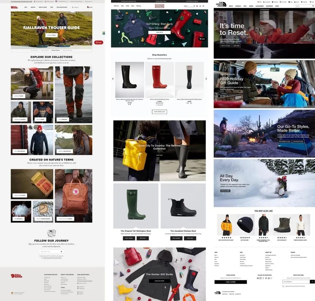
Fjällräven (left), Hunter Boots (centre) and The North Face (right) use different imagery and navigation for outdoor products.
Branding means more than a logo. Decide what promise the store makes, which audience it serves and how photography, illustrations, language and page layout will express that promise. Keep a short, usable reference for everyone creating banners, product cards and email campaigns so that a new promotion still looks and sounds like the same business.
Check the design against real pages: a long title, a discounted item, an out-of-stock item and a detailed policy page. These cases reveal whether the brand rules support usable content instead of working only on a polished homepage mockup.
2. Make navigation usable and accessible
Organise collections around how customers look for products. Provide relevant filters and descriptive labels, and make the current choice easy to see and change. On product pages, show the price, options, availability and delivery information near the purchase action.
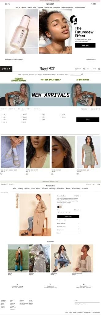
Long-page layouts from Glossier (top), Princess Polly (middle) and Reformation (bottom) show different ways to guide browsing.
Test with keyboard navigation, visible focus, zoom and a small screen. Form fields need understandable labels and errors that explain how to recover. Images that communicate information need useful text alternatives. W3C’s WCAG 2.2 provides a structured reference; a quick visual check is not a complete accessibility assessment.
Measure performance as part of usability. Google’s current Core Web Vitals are Largest Contentful Paint, Interaction to Next Paint and Cumulative Layout Shift. Check whether large hero images, apps or layout movement are interrupting the buying journey, and prioritise the problems real customers encounter.
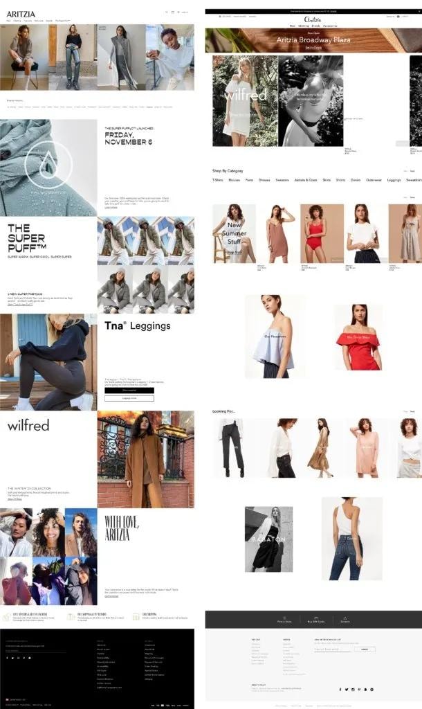
Aritzia’s 2020 storefront (left) beside its 2017 design (right) illustrates how the same brand changed its online presentation.
The older article emphasised that a visitor should know where to go without learning how the merchant organises its warehouse. Name categories with customer language, show a useful search result for common terms and keep a clear path back from a filtered collection. Place contact, delivery and return information where someone deciding to buy is likely to look.
Usability should be tested with real products. Ask a new visitor to locate a specific size, compare two alternatives, understand an offer and finish checkout. Observe errors rather than coaching them; a well-placed explanation often helps more than a decorative animation.
Before choosing a layout, ask: what should a visitor notice first, what details do they need before buying, which products should be featured, and where can an image explain something better than text? A homepage prompt, collection filters, expandable specifications and related-product suggestions can each help when they answer one of those needs; install them for a purpose, not merely to add features.
3. Keep content and operations maintainable
Assign ownership for products, stock, promotions, policies and technical maintenance. Write a publishing checklist so that a routine campaign update does not leave broken links, expired prices or untranslated content. Give the operating team training in the actual system they will use.
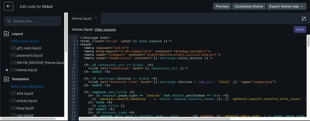
Before changing a theme or installing an app, understand what it affects and keep a way to reverse the change. Test product selection, discounts, payment, shipping and confirmation messages after changes. The required team size depends on the store; a small business can use a clearly responsible owner with specialist help rather than assuming a large permanent team is essential.

A laptop displaying a 404 error illustrates why broken links need regular checks. Photo: Erik Mclean / Unsplash.
Use support enquiries and search behaviour to guide content improvements. Analytics and session tools can help, but their collection should match your privacy choices and disclosures. A measurement dashboard is useful only if someone turns the findings into a practical fix.
A good store must remain easy to operate after launch. Document how to add a product, edit a collection, change a promotion and handle a sold-out variant. If every small update needs a developer, campaign timing and catalogue accuracy suffer; if anyone can change anything without review, errors become equally likely.
Set a simple workflow: one person prepares the content, another checks the price, stock, links and language, and an owner confirms the live result. Keep a record of app and theme changes so a broken checkout or banner can be traced and reversed quickly.
4. Make offers clear and commercially sensible
Show the actual offer, eligibility, end date and exclusions together. A welcome discount or seasonal promotion should have a defined purpose and an affordable cost. Calculate the margin after discounts, shipping, payment fees and expected returns before choosing the headline percentage.
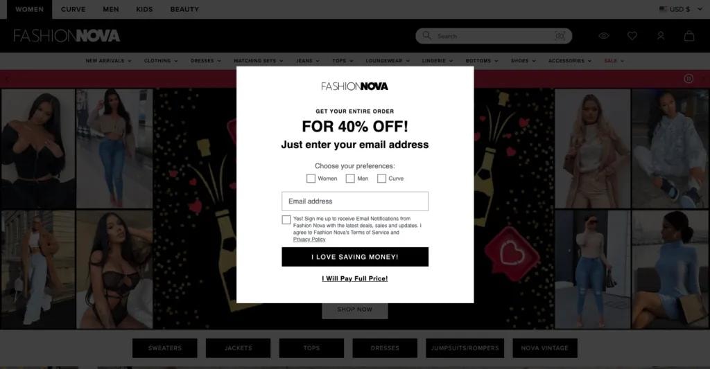
Fashion Nova’s email sign-up pop-up presents a 40% discount and asks for contact details.
Use urgency only when there is a real deadline or limited stock. Avoid repeating countdowns, hidden conditions and popups that prevent shoppers from using the page. If an offer invites email subscription, explain the marketing choice and provide a straightforward unsubscribe route. Test the code and its combinations in checkout before promoting it.
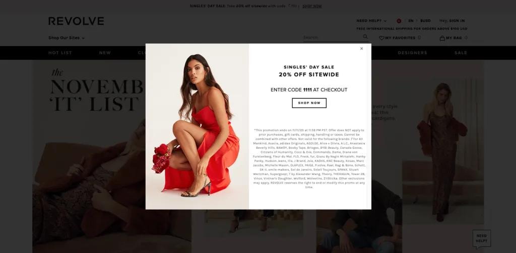
Revolve’s email sign-up pop-up presents a 20% first-order offer beside its storefront.
The old examples distinguished a welcome offer from a seasonal sale. A welcome offer can introduce a new customer to the range, while a seasonal campaign can move selected inventory or reward regular buyers. These are different goals, so compare new-customer cost, repeat orders and stock position rather than applying the same percentage to every item.
Use historical sales and product margins to decide which items can join a promotion and which should be excluded. Publish the conditions beside the offer, then test an eligible and an ineligible basket. Retain enough stock and customer-service capacity to deliver the promise if the campaign succeeds.
5. Earn trust through authentic reviews
Ask customers for honest feedback after they have had an appropriate opportunity to use the product. Explain how reviews are collected and moderated. Do not invent testimonials, selectively solicit only positive comments or condition a reward on a favourable rating.
If incentives are used, check the review platform’s rules and disclose the incentive appropriately. Show useful product-specific detail and respond constructively to concerns. Reviews can help shoppers make decisions, but they do not guarantee lower returns or higher sales.
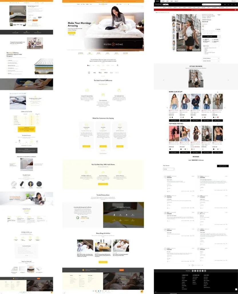
Hush Home (left and centre) and Fashion Nova (right) show different ways to present product information and shopper reassurance.
Google may show eligible review information in search when the content and structured data meet its guidelines. Adding star markup is not a guarantee of a rich result. Keep the visible reviews and structured data consistent, and do not apply product-review rules indiscriminately to self-serving business testimonials.
Because a buyer cannot touch an online product, previous purchasers can provide useful context. Invite reviews after delivery and allow enough time for use. Ask for details such as size, fit, use case or delivery experience so feedback helps a future shopper judge suitability, rather than presenting only a row of stars.
A critical review can reveal unclear descriptions or a service problem. Respond with a real remedy and improve the page where appropriate. Do not assume review markup will produce a search snippet, and keep any reward independent of the opinion expressed.
A practical acceptance checklist
Ask someone unfamiliar with the site to find a suitable product, understand delivery and complete a test order on mobile. Repeat the route with keyboard navigation and each supported language. Check that the promotion works, the receipt is accurate and support details are easy to find. Use the findings to prioritise the next iteration.